The A to Z of UX
The words we use in UX, with 26 examples
What started off as a LinkedIn challenge to post every day in February, now all in one easy access resource.
Like it says on the tin, a different word for every letter of the alphabet.
I hope you’ll find it useful.
The why
2021 was the year of the career pivot for many, myself included. I shifted my focus from translating screenplays and localising apps to UX writing and content design.
I went back to school. I got some new clients. I let some old ones go. I switched up my portfolio to focus on this new exciting direction and I met some generous folk much further along their careers who imparted their words of wisdom and encouragement.
In short: my brain was fizzing with all this new information.
What better way to make sense of it all, than create resource I could use as a reference and share with others?
Let’s dive in.
A is for Accessibility
Alright, let's start this off with a big one.
Accessibility means that everyone has equal access to your website or product, no matter how or where they interact with it.
— and they all have an equal experience.
What's more,
The UN recognises access to information and communication as a basic human right.
So, who benefits?
People who are:
Using screen readers
Hard of hearing
Living in rural areas with low internet connection
Using less up-to-date devices
....in a variety of other situations that you cannot predict!
Inclusive design benefits everyone
What can you do about it?
Include alternative text in images
Provide text transcript for video with audio
Read up on it!
Recommended reading: This resource is a great place to start and this article by Sarah Winters at Content Design London.
And remember:
Accessible design is good design
Accessible design is for everyone
B is for Bias
Everyone has it...but nobody talks about it.
Yep, you're biased, I'm biased, and your dog probably is too.
It's our brain’s way of making quick decisions and it's not all bad.
But wait! As UX designers and writers, it's important we recognise our own bias and blind spots, so we don't recreate them in our digital products.
Our world is full of inequalities, so let's change things.
Ways you can recognise and overcome your own bias:
Work with other people: diverse teams bring different perspectives
Ask for feedback, and act on it
Test and test again
Test some more
Recommended reading: Design for Cognitive Bias by David Dylan Thomas. Bonus, the lovely folk at a Book Apart let you read a free sample chapter before you buy.
C is for Concise
This a short and snappy one.
If you can say it in 4 words, don’t use 10.
Let’s move on.
D is for Dumbing Down
I can’t promise this will be the last time I reference Sarah Winters, coiner of the term “Content Design” and all-round straight-talking getting-things-done UX (sorry, Content Design) advocate.
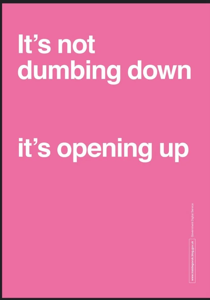
On why we should use plain language.
Image taken from Government Digital Service on the benefits of plain language:
“It’s not dumbing down, it’s opening up”
Uncomfortable truth: Most people don't read your website.
They skim, whilst watching Netflix, planning their dinner and messaging their mates.
They're commuting to work, waiting for the bus, looking after kids.
People are busy.
Respect their time.
What can you do about it?
If you use high frequency words, your users can
skim
find what they're looking for
.....and get on with their day.
Because UX isn't about blowing someone's mind with your free-flowing prose.
It's about getting someone from A to B.
Recommended reading: The Content Design book by Sarah Winters (No, I don’t get commission) and this article on How We Read by Jason Santa Maria again, from the brilliant A List Apart website from the A Book Apart folks. Everything they publish is gold, I’m telling you.
E is for Empathy
There’s one skill you really need to work in UX...Empathy!
Actually, scratch that.
I reckon it’s crucial for most jobs.
If you don’t empathise with your users, your customers, your clients...you won’t be providing solutions.
Remember the UX mantra: you are not your user!

Repeat after me: you are not your user!
What does empathising look like?
It means:
— not blaming your user when something goes wrong
— not making them feel guilty when they unsubscribe from your newsletter
— providing reassurance and a solution when mistakes happen (and they will)
It also means:
— putting yourself in their perspective
— not making assumptions
— doing your research
Assuming that everyone thinks like you and will behave in the same way is called the False-Consensus effect. Those who behave differently are considered deviant, or other.
It’s not helpful and it affects a product’s usability.
What can you do about it?
User research. Never assume anything!
Recommended reading: You Are Not the User: The False-Consensus Effect article by Nielsen Norman Group.
F is for Feedback
One big difference between how I used to work (in translation) and how I work now (UX and Content Design) is the amount of feedback.
And I love it!
Feedback used to strike fear into my little freelancer heart.
What if they think it’s terrible?
…So terrible they won’t even pay me?
…..And I’ll never get hired ever again? (you get the idea)
Back then, I had to actively request feedback on my work.
Now, it’s a useful and essential part of the process.
Feedback = Progress
Because digital products are never really done.
— They can always be tweaked, adjusted, or removed if they’re not doing their job properly.
— They require constant testing, iterating, improving.
And you can’t do that without feedback.
G is for Government Design Systems
Some organisation focus on specific user groups and have to keep up with the competition.
Other organisations automatically have the monopoly on all users because they literally have no competition. Their users have nowhere else to go.
Enter: government organisations.
This can mean that the systems are outdated, slow and frustrating.
Or, it can mean that successful content design makes a difference to everyone. Pretty big claim, huh?
The Government Design System in the UK are were big change makers in this area (yes, I’m referencing Sarah Winters again) but plenty of others are following suit.
This affects everyone
Have you ever had to renew your passport or driving licence?
Sign on for employment benefits?
Been furloughed?
Get a marriage certificate, or a deal with a death and all the paperwork that comes with it?
Government design systems are working to make these unavoidable headaches more intuitive, more helpful, less exasperating.
For those working in governance — especially those keeping up with the UK governments ever-changing regulations — you’re doing a great job.
H is for Human

Write for humans, not robots
Image taken from Flight of the Conchords, ‘The Humans are Dead’. If you know, you know.
If you’re writing for digital products (or let’s face it, anything that’s not actually a robot character)....don’t write like a robot!
If you wouldn’t say it in real life, then don’t write it in your digital copy.
Here’s a few ways you can speak human:
Error #427%6! → There’s a problem loading this page
Discard changes → Cancel
Text field validation error → Have you forgotten your password?
Which ones sound better?
If you’re not sure, try reading it out loud.
Does it sound strange? Then it probably is.
Remember: Human-centred design is for humans, not robots!
Recommended viewing: the original video.
No, it’s not a UX-based piece of research but it is catchy. Ideal to keep in your head when you’re next writing an error message.
I is for Inclusive Design
Time for something a bit more serious.
Why is this important?
Because when you’re inclusive, you’re not excluding anyone.
I love this quote from Jacquelyn Iyamah:
Inclusive content design is about creating content for needs that may not be the same as our own.
This is a really big topic but it’s crucial when you’re building products and digital experiences.
A good place to start
Let’s take a look at inclusive language, because becoming more aware of the words you use every day makes a difference.
Here are some ways you can make your language more inclusive:
❌ he/she → they. The default is not male!
❌ ‘crazy’ → ‘wild’, ‘ridiculous’, ‘absurd’
❌ 'I'm a little bit OCD' does not mean being tidy or organised
❌ Disabled person → wheelchair user
A good place to continue
This article from Design Council on Inclusive Design: Beyond Accessibility
This article from Jacquelyn Iyamah (quoted earlier) on The Importance of Inclusive Content Design
J is for Jargon
👋 Hey! Let’s async and chat KPIs, ROIs and CTR by EOD.
Have I lost you yet?
Okay, so some of those are pretty well-known but imagine a page full of them when you’re trying to do a specific task.
It’s...
❌ Unhelpful
❌ Confusing
❌ Alienating
Jargon exists because it’s efficient, but only in specific contexts.
Before you start writing, consider whether this complex language is absolutely necessary.
Chances are, you could say it in a simpler way.
You owe it to your reader.
Be respectful of their time and stop trying to show off with those fancy big words!
As the Nielsen Norman group say:
“Plain language is for everyone, even experts”.
Amen to that.
K is for Keep Learning
Working on digital products means you need to be a forever learner.
Fortunately, there are plenty of excellent resources out there.
📖 Keep reading
Content Design London blog that focuses on quality, not quantity (as you’d expect). A host of different writers and guests that looks at the whole process and how different teams work.
UX Content Collective is a gold mine of information, and they’ve even collected the top 50 UX writing resources from 2021 for you.
The Nielsen Norman group: no matter how specific or niche, they’ve got a super useful article on it. I promise you.
Working In Content for interviews with content people of different disciplines, at all stages in their career.
All of these have regular newsletters too, if that’s more your thing.
🎧 Keep listening
My personal favourites are the Content Strategy podcast with Kristina Halvorson and Content Rookie with Nicole Michaelis. Both feature interesting interviews with top content people, from all kinds of backgrounds.
🗣 Keep talking
Kind and generous folks let you book a chat with them, for free! Like UX coffee hours and ADP List. Join the community, find a mentor, and get talking.
📚 Keep studying
And of course, I couldn’t do this list without mentioning the UX Writing course I’m studying at Elisava.
Depending on your time and budget, there are lots of different ways you can upskill and learn more about UX.
I chose this course because I wanted to connect with other people in Barcelona and because it’s taught in Spanish. I also wanted to be the only English speaker in the room, and strategically, I’d say it’s paid off. Sometimes it helps to stand out.
L is for Localisation
A UX topic close to my translator heart.
Localisation means adapting your product to the local culture.
I say “adapting”, because sometimes you might need to make a whole new product!
It’s not as straightforward as translating the text from one language to another.
Let’s take a look at some stats:
Hindi is spoken by 425 MILLION people 🤯
Spanish = 572 MILLION
Chinese = 1.3 BILLION
Do they all share the same culture, customs, conventions, religion...?
Nope!
For a mega-international company like McDonald’s this means:
In India, beef burgers are replaced with chicken “Maharaja burgers” 🐓
In Chile, you can get cheese-filled empanadas alongside your chicken nuggets 🥟
In China, apple pie becomes taro pie (Google it!) 🟣
CAVEAT: This is just ONE way a company can adapt to its audience but this is just the tip of the iceberg.
TL:DR; Localisation is another discipline within Content Design and is so much more than just translation.
M is for Microcopy
When most people think of UX writing, they think of buttons.
The tiny bits of copy...
If done well, these little words can have a big impact.
But wait, microcopy isn’t just buttons!
It also includes:
Placeholder text for input fields
Hints, tips, explainers
Emails subject lines
Calls to action
Because small things are important too.
And yes, also buttons.
Recommended reading: Microcopy: The Complete Guide by Kinneret Yifrah
N is for Not Native
Unpopular opinion: You do not need a native speaker.
I might be selling myself out of a job on this one as it’s definitely something I have benefitted from personally, being a native-British (West Country if we’re being specific) speaker...
But honestly?
There is so much that goes on behind the words and someone who speaks more than one language might actually....have an advantage!
Here are some benefits, specific to UX Writing:
No problem writing clear, plain language
A better understanding of what’s needed for localisation
Open to feedback (yup, because they don’t have that ‘native speaker’ gold badge)
It’s becoming more common to see job descriptions shift from “native” to “high level of English required”. But we can still do better.
O is for Order
What’s this, topic that sounds like Content Design but is actually a pretty useful way of thinking that can be applied many areas of life, not just work?
Organising a wedding?
Moving house?
Applying for jobs?
I’m talking about the stuff that doesn’t get mentioned as much as buttons.
Documentation, components, content design systems, style guides...
The things that:
Keep content consistent
Allow everyone on the team to work confidently and efficiently
Reduce conflict and subjectivity
The amount of time I would have saved if we’d have one in my last job. No more hours spent searching for one specific document, or finding the wrong version.
We can all bring a bit more order into our lives, not just if you’re a content designer.
If you’d like to know more, I recommend this interview on the Content Strategy podcast with Abby Covert about her book, “How to make sense of any mess”.
P is for Psychology
Something I was surprised by when I started studying UX and Content Design was the amount of thinking involved.
I thought it was all about the words!
Well, not so much.
If good UX helps the user and doesn’t make them think, using psychology principles can really help.
One big point is that humans like consistency.
It means we don’t have to think when we’re online, making decisions.
For example, we know:
— The basket icon will show items we’ve selected
— The floppy disc icon means save (remember those?)
— The play icon means video
We expect these things when we're online.
If things aren't as we expected, we don't trust them.
If content is inconsistent, it’s...
— Confusing
— Frustrating
....and you’ll probably leave the page and go somewhere else!
Recommended reading: “Don’t Make Me Think” by Steve Krug is a classic, for good reason.
Q is for Question Everything
“So, do you have any questions?”
If the answer is no...you probably don’t work in Content Design! 🙃
Jokes aside, a fundamental part of UX work is to ask questions.
Relentlessly.
Like a toddler.
Why?
— This is the way we've always done it.
But why?
— It would be too much work to change it.
But why?
—Our audience like it this way.
...Why?
Just because something has ‘always been done that way’ doesn’t mean it can’t be changed.
Asking questions means you gain better insight into what you're working on, and who you're doing it for.
And really, there's no such thing as a stupid question.
Never assume anything — Don’t take anything for granted — And always, always, ask WHY!
R is for Re
I know, I know.
“Re” is a prefix, not a word. But there were too many words and I couldn’t pick just one.
Redo, redesign, reread, research, reiterate...
UX is a user-centred, data-informed process that can always be improved.
Something I love about this discipline is that nothing is set in stone, and mistakes are seen as learning opportunities.
Evaluate, assess, improve.
Refine.
Repeat.
And then do it all again 🙂
S is for Sexist Language and Stereotypes
In digital products, there’s absolutely no reason to recreate the sexist language that we’re so used to hearing and seeing in real life.
We can do better!
Here are some ways you can be less sexist in your language:
Job titles
Policeman = Police officer
Businessman = Businessperson
Fireman = Fire fighter
Manpower = Workforce
And while we’re here...
Female comedian = Comedian
Female writer = Writer
Female director = Director 🤷♀️
Gendered language
Is it really a “catfight” or is it two women competing against each other?
Are they “bossy” or is “assertive” a better adjective?
Is this person “difficult” or just not conforming to the people-pleasing role that the patriarchy wants?
Sexist questions and comments
If a mother is out, at work or socialising, don’t ask who is looking after their child.
“So, when are you having kids?” is not an acceptable question for small talk (I’m looking at you, driving instructors)
If you’re talking about a woman, don’t include her marital status unless it is absolutely necessary (I'm still trying to think of a context where that would be the case, to be honest)
...And while we’re at it, don’t include what she’s wearing or how she looks. Why are her shoes important? 🤔
Phew!
This is just the tip of the iceberg.
The TL; DR
Don’t assume
Don’t perpetuate stereotypes
....And stop calling women difficult!
Thank you.
T is for Testing
How do you find out if your product actually works?
You validate the hypothesis!
In other words = you test the thing.
If you have a product, app or service, you need to make sure it works on real users.
Because you are not your user!
Usability testing is crucial and works best when it happens throughout the design process, not just at the end.
This means you can:
Uncover potential problems as you go
Learn more about your user’s behaviour
And you don’t get a shock at the end of a project, when it will be a lot more work to fix.
Win-win, right?
This can be applied to all sorts of things, not just UX.
So, if you’re sitting on a blog post and you’re not sure if it’s ready...
You’ll never know until you get some actual user feedback.
So: publish it, hit send, and see what happens!
U is for User
Users are at the heart of everything we do.
After all, UX = User Experience
Your users are the people that use your app, product or service:
To book their doctor’s appointment
Do their grocery shopping
Listen to music
They don’t want to spend time and energy….
Figuring out how to navigate a page
Trying to understand ambiguous instructions
Getting an obscure cultural reference ...
when all they want to do is unsubscribe from your mailing list!
→ If what you’re creating doesn’t serve the user, then what’s the point?
UX has to be useful, helpful and consistent,
So users can do what they need to do, and get on with their day.
V is for Voice
How would you describe your voice?
When I worked as a teacher, my voice would always be the same
but the tone would vary:
Reading a story to a class of 4 year olds
Giving feedback to an exam group
Speaking to parents at teacher – parent meetings
I was always a teacher and I tried to keep my voice positive, kind and understanding.
If it suddenly changed, that would be confusing, right?
— The same thing can be applied to products or services.
The voice stays the same, but the tone varies depending on the context and situation.
For example, a FinTech company might use a playful tone for confirmation messages, but be more serious and direct in an error message.
If the tone is the same for both contexts, it could look like this:
✅ "Your transfer is on its way!"
❌ "Your transfer couldn’t be delivered, sorry!"
Frustrating and unhelpful, right?
This is why voice and tone are important to get right.
They can make the difference between an enjoyable experience and a downright annoying one.
W is for Welcoming
Maybe it’s because UX is a relatively new discipline?
...Or perhaps it’s because people drawn to work in Content Design are just naturally friendly, really clever, and incredibly good looking?!
Whatever the reason, the Content Design community are a welcoming bunch.
It can be hard changing careers and working remotely but it doesn’t have to be.
There are:
Groups you can join and people you can connect with
Professionals offering mentoring and virtual coffees
Loads of useful resources from people sharing what they know
Free talks and webinars
Not to mention all the Meetups, Slack channels, forums, Twitter, LinkedIn…
Are we LinkedIn friends yet? Come and say hi, I’d love to hear from you.
X is for Experience
One thing I always get asked about UX...
Why the heck is it called UX and not UE?
X is actually used phonetically in lots of places:
XL = Extra large
XML = Extensible Markup Language
and also, let's not forget...
INXS = the band
Maybe it's not so strange after all!
Y is for Yes
What top tip works whether you're giving a presentation at work, having a discussion with a friend, or performing in an improv group...?!
— Start with a 'Yes ,and...'!
✅ If you say 'Yes, and...' you accept what the other person is saying, and you can continue the conversation.
❌ If you say 'No, but...', you challenge what the other person is saying, and the conversation will get stuck.
— Every 'No' discourages feedback and discussion
— Every 'Yes' builds trust and collaboration
And collaboration is crucial to UX teams.
'Yes, and' is an acceptance principle in improvised theatre that means the actors can keep on building the scene, together.
And it works in other areas too.
Remember, saying 'Yes' doesn't mean you agree, but it does start a positive conversation.
Z is for Zzzz
You know how the best ideas come to you when you’re in the shower, out on a walk or cooking dinner?
Basically, doing anything but sitting at your desk, looking at the work you’re supposed to be doing.
If you're stuck looking for a solution, sleeping on it will help:
- Get a fresh perspective
- Let your brain process
- Wait for the ideas to come!
This is also why I really dislike working against tight deadlines.
I get it, sometimes it happens.
But everything works better when it’s had time to breathe a bit.
So, whenever you can, step away from the screen. Get some fresh air. See what happens tomorrow.
That’s it, folks!
I hope you’ve found this useful. Feel free to leave comments down below, or message me directly here.