Coursework from UX Writing and Content Design course
The What
I studied the very first postgraduate course in UX Writing and Content Design at SHIFTA by Elisava design school, Barcelona.
I’m sharing an exercise from one of my favourite UX topics: plain language.
The challenge: Find a piece of content that is confusing and rewrite it in plain language, explaining your choices.
The context: If you travelled during the pandemic then you’ll know that each country has its own requirements and paperwork, and Spain — a country that loves bureaucracy — is no exception.
I would love there to be an agreed glossary for all things related to COVID-19 (or is it Covid? the ‘vid? Corona?) that would save people stress, uncertainty and frustration.
Alas, there isn’t, and they haven’t asked me to create one.
So I fixed this one for my coursework instead. 🙃
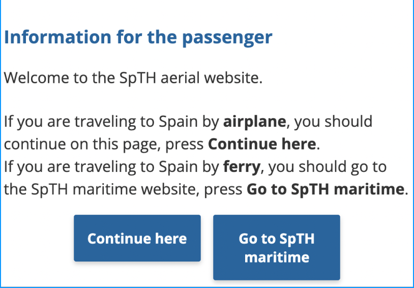
Original pop up message from Spain Travel Health website.
What am I looking at?
This is a pop-up message that appears when the user searches for COVID-19 requirements for travelling to Spain.
Why’s it an issue?
Travelling is stressful, especially if you’re trying to understand confusing regulations and jargon.
Incoherent and inconsistent messaging are frustrating for the user, but it doesn’t have to be this way.
What’s wrong with it?
Readability: too much text in a small space.
Jargon: acronyms that the user won’t understand. What is SptH?
Repetition: if there is a button, the user doesn’t need to be told ‘press the button with the same word as this sentence’
Unclear call to action (CTA): what is the user supposed to do here?
Unnatural language: “Information for the passenger” should be “Passenger information”, likewise nobody “presses” a button online, we “click” or “tap”
Limited options for the user: no option for passengers arriving by car (or bike, or by foot)
Let’s make it better!
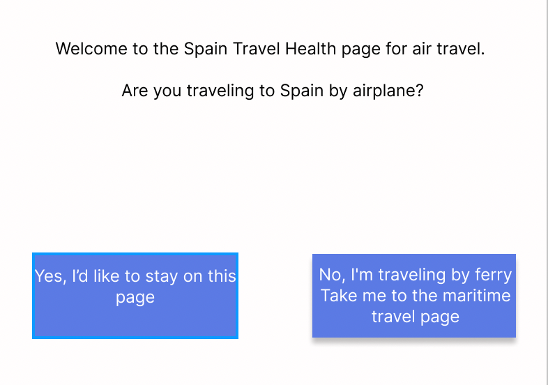
Text: Welcome to the Spain Travel Health page for air travel. Are you traveling to Spain by airplane?
First iteration:
I replaced ‘SptH’ with “Spain Travel Health”
I removed the title “Information for the passenger” because asking a direct ‘you’ form question makes it clear.
The message is clearer and the user understands what will happen when they click the button.
However, there’s still too much text.
Let’s try again.
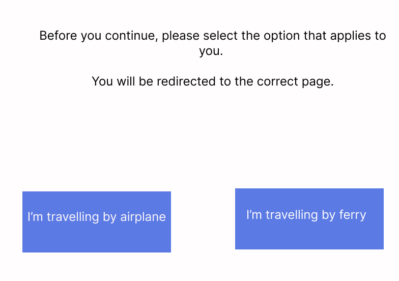
Text: Before you continue, please select the option that applies to you. You will be redirected to the correct page.
Second iteration:
I removed the ‘Welcome to the...”. If this pop up appears on their website, this information is redundant.
The messaging is more direct and concise, with less text and as a result, less cognitive load for the user.
However, the tone is quite cold and formal but for a government institution, this might not be a priority.
The lesson:
How many people actually read pop-ups? I know I don’t, and I’m a UX Writer.
If this information is truly important, it should be made more obvious and not stuck in a pop-up that the user might not read.
For example, a banner on the landing page or a funnel that redirects users to where they need to go.
I’m biased but gov.uk are a great example of this. They limit the amount of information shown to the user so the experience isn’t overwhelming. Spain, take note!